
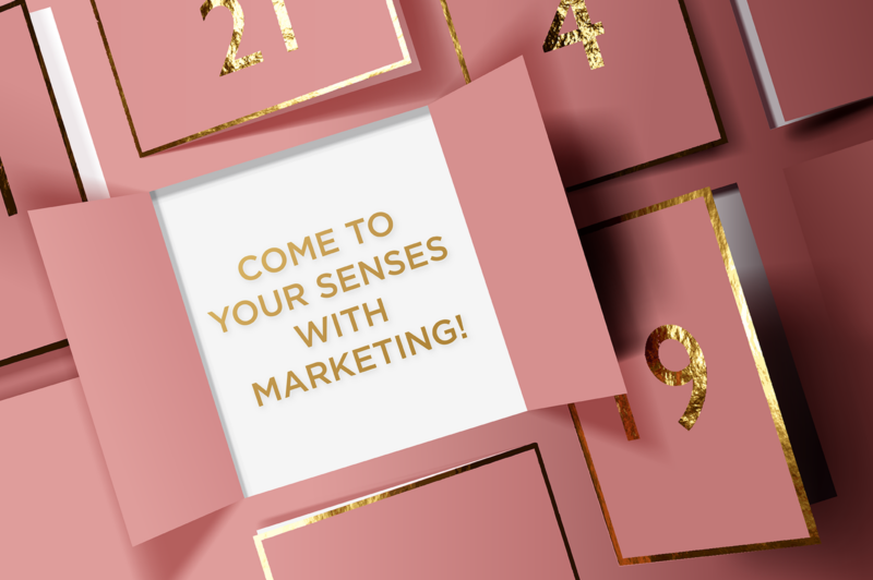
Come to your senses with marketing!
Channel 4 recently aired its new series of ‘Luxury Christmas for Less’ to show viewers how to indulge in luxury festive products without busting budgets. What was evident while watching the programme was the attention that had been paid to labelling and packaging in terms of look, feel and finish, to ensure products appeared more premium and, in some instances, emulated their brand equivalents.
One particularly interesting item was about advent calendars. You could attribute their popularity to value for money but, as the programme pointed out, most are not, with the exception of some highly prized beauty ones. But what they do tick in pretty much every box is sensory appeal, a much under-estimated aspect of marketing.
Advent calendars are exciting because they hold promise behind their closed doors and drawers. And if you’re a brand, your name is firmly in front of the customer for the best part of December so what’s not to like about that? But the reason they’re real catnip to customers is because they’re tactile and fun to open, they lure you in visually and they don’t even need to contain edible or fragrant contents to appeal to your sense of taste and smell as it can form part of the packaging itself.
At EPIC2020, the Retail Institute spoke about sensory marketing in packaging. It claimed consumers base judgement on a product’s quality by their perception of its packaging. In other words, they judge books by their cover so what you put on the pack sets the expectation and tone of its quality.
It went on to say that 83% of marcomms appeal to only one sense, vision, which means many opportunities to fully connect with consumers through print are being missed.
The video presentation was littered with examples of olfactory, auditory and haptic engagement and it’s definitely worth a watch. Ricoh also wrote recently about the importance of touch when considering print finishing techniques and processes.
It referenced a study by Canadian neuro-marketing firm TrueImpact that compared direct mail (DM) with emails and display advertising. It reported that DM required 21% less cognitive workload, which resulted in higher brand recall. DM also proved more persuasive than digital with motivation response some 20% higher.
These findings suggest how valuable touch is when considering print finishing but it’s also important to factor in choice of paper stock too. The Retail Institute referenced a study where participants were shown identical content in two magazines, one printed on higher quality paper and the other on cheaper stock. All participants showed physiological signs of increased pleasure when reading content on the higher quality stock and were all said to trust it more than its cheaper counterpart, all were even prepared to pay its cover price of £10.
Such findings are of no surprise to us. Our business has relentlessly been built on producing high quality printed communications and marketing collateral.
It’s all too easy to think 2-dimensionally when creating marketing communications but print effects and finishes are so advanced these days that you need to come to all your senses when considering design solutions. We’d be happy to discuss any forthcoming projects you think we might be able to help with. Let’s think beyond the confines of Advent month and start opening some doors all year come 2022.